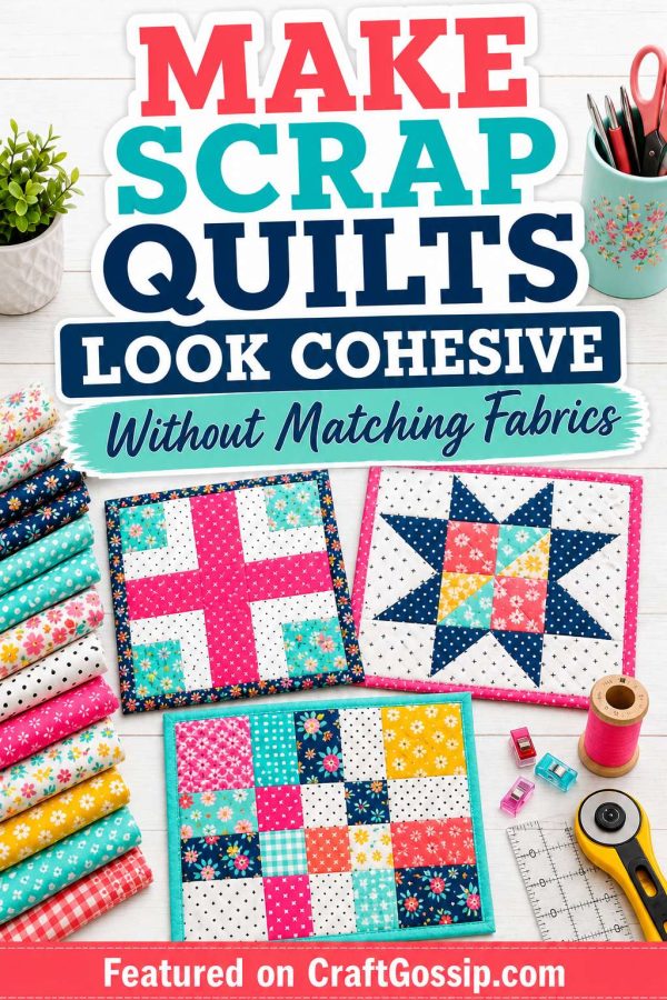
How to Make a Scrap Quilt Look Cohesive Without Matching Fabrics
Scrap
quilting
has
a
funny
way
of
making
us
feel
both
wildly
inspired
and
slightly
nervous
at
the
same
time.
On
one
hand,
there
is
the
joy
of
using
what
you
already
have,
pulling
from
favourite
prints,
leftover
strips,
old
bundles,
and
those
little
pieces
that
are
too
lovely
to
throw
away.
On
the
other
hand,
there
is
that
tiny
voice
in
the
back
of
your
head
whispering,
What
if
this
turns
into
a
hot
mess?
And
honestly,
that
is
the
part
that
stops
a
lot
of
quilters
before
they
even
begin.
The
good
news
is
this:
a
scrap
quilt
does
not
need
matching
fabrics
to
look
beautiful.
It
does
not
need
a
coordinated
designer
bundle,
a
perfect
rainbow
layout,
or
a
strict
colour
recipe
to
feel
intentional.
What
it
does
need
is
a
little
visual
structure.
Once
you
understand
a
few
simple
tricks,
you
can
make
a
scrap
quilt
look
cohesive,
balanced,
and
thoughtfully
put
together,
even
when
every
fabric
came
from
a
different
project,
year,
or
shopping
mood.
This
is
one
of
the
reasons
scrap
quilting
remains
such
a
favourite.
It
is
practical,
thrifty,
creative,
and
deeply
satisfying,
but
it
also
teaches
you
how
to
work
with
colour,
scale,
contrast,
and
repetition
in
a
much
more
relaxed
way.
If
you
have
ever
looked
at
a
pile
of
leftovers
and
wondered
how
on
earth
people
turn
that
into
something
gorgeous,
you
are
absolutely
not
alone.
If
you
are
already
in
full
stash-busting
mode,
you
might
also
enjoy
these
related
reads
on
20
Scrap
Quilt
Ideas
That
Actually
Look
Beautiful,
Scrap
Quilt
Patterns
That
Actually
Look
Beautiful
(Not
Busy
or
Chaotic),
Tiny
Scrap
Quilt
Ideas
for
Fabric
Pieces
Too
Small
to
Fold,
and
String
Quilt
Ideas
for
Skinny
Strips
and
Rotary-Cutting
Leftover
Scraps.
They
all
work
beautifully
together
if
you
are
building
a
whole
little
scrap
quilting
obsession,
which,
let’s
be
honest,
is
very
easy
to
do.
Why
scrap
quilts
can
look
messy
Usually,
it
is
not
because
the
fabrics
do
not
match.
It
is
because
there
is
no
visual
anchor.
That
is
such
a
helpful
shift
to
remember.
Matching
fabrics
are
only
one
way
to
create
harmony.
You
can
also
create
harmony
through
repeated
colours,
consistent
block
shapes,
background
fabric,
similar
value
contrast,
or
a
limited
overall
mood.
A
scrap
quilt
starts
to
feel
chaotic
when
everything
is
competing
at
once.
Too
many
colour
families,
too
many
fabric
scales,
too
many
strong
contrasts,
and
no
repeated
element
to
settle
the
eye
will
do
that
every
time.
The
goal
is
not
to
make
every
fabric
behave.
It
is
to
give
the
quilt
enough
structure
that
all
those
different
fabrics
can
live
together
happily.
1.
Start
with
one
unifying
colour
This
is
probably
the
easiest
and
most
effective
trick
of
all.
Even
if
none
of
your
fabrics
match,
your
quilt
will
instantly
feel
more
cohesive
if
one
colour
repeats
throughout
the
whole
design.
It
does
not
have
to
dominate.
It
just
needs
to
appear
often
enough
that
the
eye
starts
to
connect
the
pieces.
For
example:
navy
repeated
in
small
florals,
geometrics,
and
blenders
soft
pink
appearing
across
warm
and
cool
prints
aqua
or
teal
scattered
throughout
the
quilt
cream
or
low-volume
prints
tying
brighter
scraps
together
This
is
why
some
scrap
quilts
feel
effortlessly
polished.
They
are
not
actually
“matching”
in
the
traditional
sense.
They
simply
keep
circling
back
to
one
familiar
colour.
If
you
are
staring
at
a
mixed
pile
of
scraps,
pull
out
everything
that
includes
even
a
touch
of
your
chosen
anchor
colour
and
start
there.
That
small
bit
of
repetition
goes
a
very
long
way.
2.
Use
a
consistent
background
fabric
If
you
want
a
scrap
quilt
to
calm
down
quickly,
background
fabric
is
your
best
friend.
A
steady
white,
cream,
linen,
pale
grey,
or
soft
low-volume
background
creates
breathing
space
between
busy
prints.
It
helps
all
the
scraps
feel
like
they
belong
in
the
same
quilt,
even
when
the
colours
and
prints
vary
wildly.
This
works
especially
well
for:
plus
quilts
sawtooth
star
quilts
churn
dash
blocks
log
cabin
variations
simple
patchwork
layouts
scrappy
half-square
triangle
designs
A
consistent
background
gives
your
eye
somewhere
to
rest.
It
also
makes
the
colour
scraps
pop
in
a
cleaner,
more
intentional
way.
If
your
scraps
are
especially
loud,
bold,
or
multicoloured,
this
one
change
alone
can
completely
transform
the
finished
look.
3.
Repeat
the
same
block
over
and
over
One
of
the
simplest
ways
to
make
random
fabric
feel
organized
is
to
use
a
single
repeated
block.
The
fabrics
may
all
be
different,
but
when
the
block
structure
stays
the
same,
the
quilt
feels
orderly.
This
is
why
scrap
quilts
made
from
repeated
stars,
plus
signs,
rails,
or
churn
dashes
often
look
so
much
more
cohesive
than
completely
random
patchwork.
The
block
becomes
the
framework.
The
scraps
get
to
be
playful
inside
it.
This
is
especially
helpful
if
you
are
nervous
about
working
with
a
lot
of
variety.
Choose
a
block
you
already
know
and
trust,
then
let
the
fabrics
do
the
interesting
part.
That
way
you
are
only
managing
one
kind
of
chaos
instead
of
two.
4.
Pay
attention
to
value,
not
just
colour
This
is
the
part
that
changes
everything.
A
quilt
can
be
full
of
different
colours
and
still
look
cohesive
if
the
light,
medium,
and
dark
values
are
balanced.
In
fact,
value
often
matters
more
than
colour
when
it
comes
to
making
patchwork
read
clearly.
If
every
scrap
is
medium-toned,
the
whole
quilt
can
look
flat.
If
every
scrap
is
bright
and
high-contrast,
the
quilt
can
feel
noisy.
If
you
mix
lights,
mediums,
and
darks
with
intention,
the
design
starts
to
make
sense.
Try
this:
pair
darker
prints
with
lighter
backgrounds
spread
very
dark
fabrics
across
the
quilt
instead
of
clustering
them
in
one
spot
mix
softer
prints
with
stronger
ones
step
back
often
and
squint
at
the
layout
to
check
contrast
You
are
not
aiming
for
perfection
here.
You
are
simply
trying
to
make
sure
the
quilt
has
enough
visual
rhythm.
5.
Limit
the
number
of
“shouty”
fabrics
Every
scrap
quilt
can
handle
a
few
divas.
It
just
cannot
handle
twenty
of
them
all
yelling
at
once.
If
you
have
some
very
bold
prints,
neon
colours,
novelty
fabrics,
or
high-contrast
pieces,
use
them
sparingly
and
scatter
them
around.
Let
them
be
accents
rather
than
the
whole
story.
A
good
rule
of
thumb
is
to
mix:
a
few
bold
prints
several
softer
prints
a
handful
of
subtle
blenders
or
tone-on-tones
some
calmer
fabrics
with
less
contrast
This
creates
layering,
which
is
what
makes
a
scrap
quilt
feel
rich
instead
of
chaotic.
If
you
love
a
loud
print,
absolutely
use
it.
Just
do
not
make
every
single
fabric
fight
for
the
spotlight.
6.
Sort
scraps
into
colour
families
first
Before
you
start
sewing,
spend
ten
minutes
sorting.
Not
forever.
Not
into
a
museum-level
filing
system.
Just
enough
to
give
your
scraps
some
kind
of
order.
Try
grouping
by:
warm
colours
cool
colours
lights
darks
low-volume
neutrals
brights
florals
versus
geometrics
This
helps
you
see
what
you
actually
have,
which
is
often
half
the
battle.
A
random
pile
on
the
table
always
looks
more
chaotic
than
the
exact
same
fabrics
grouped
into
soft
colour
families.
Once
sorted,
you
can
decide
whether
you
want:
a
warm
scrap
quilt
a
cool
scrap
quilt
a
rainbow
layout
a
muted
vintage
look
a
soft
low-volume
mix
a
bright-and-happy
scrappy
feel
You
do
not
need
matching
fabrics.
You
just
need
a
direction.
7.
Let
one
style
lead
If
all
your
fabrics
come
from
different
places,
let
one
overall
vibe
guide
the
quilt.
For
example:
vintage
florals
and
faded
prints
bright
modern
prints
with
white
space
cottage
colours
with
small-scale
pattern
earthy
tones
with
warm
reds
and
golds
soft
low-volume
neutrals
with
gentle
contrast
This
is
a
lovely
trick
when
you
are
sewing
from
stash.
You
may
not
have
matching
collections,
but
you
can
still
create
a
quilt
that
feels
like
it
belongs
to
one
mood.
That
mood
becomes
the
thread
holding
everything
together.
8.
Use
sashing
or
borders
to
pull
it
all
together
Sashing
is
wildly
underrated
in
scrap
quilting.
If
your
blocks
are
busy
and
varied,
adding
sashing
between
them
can
instantly
create
order.
It
separates
each
block,
gives
the
eye
breathing
room,
and
turns
a
busy
collection
of
pieces
into
something
that
feels
much
more
deliberate.
Borders
can
do
the
same
thing.
A
repeated
outer
border
in
one
steady
fabric
can
frame
the
quilt
beautifully
and
make
the
centre
feel
more
unified.
This
is
especially
useful
if
your
quilt
top
feels
a
bit
busy
once
assembled.
Think
of
sashing
and
borders
as
the
quiet
friend
in
the
group
chat.
They
do
not
need
to
be
exciting.
They
just
keep
everybody
else
under
control.
9.
Spread
colours
and
prints
across
the
quilt
One
of
the
fastest
ways
to
make
a
scrap
quilt
feel
unbalanced
is
accidental
clustering.
If
all
the
reds
end
up
in
one
corner,
all
the
dark
florals
in
another,
and
all
the
novelty
prints
across
the
bottom,
the
quilt
can
look
patchy
in
a
not-so-helpful
way.
As
you
lay
blocks
out,
try
to
distribute:
strong
colours
very
dark
prints
very
light
prints
large-scale
florals
novelty
fabrics
repeating
accent
colours
This
does
not
need
to
be
mathematical.
Just
keep
stepping
back
and
asking
yourself
whether
one
area
feels
noticeably
heavier
or
louder
than
the
others.
A
little
rearranging
on
the
design
floor
can
make
a
huge
difference.
10.
Mix
print
scale
thoughtfully
If
every
print
is
tiny,
the
quilt
may
look
busy
in
a
fussy
way.
If
every
print
is
large,
the
shapes
can
disappear.
If
you
mix
large,
medium,
and
small-scale
prints,
the
quilt
starts
to
breathe.
Print
scale
adds
texture
and
movement,
but
it
works
best
when
there
is
variety.
Tiny
florals,
medium
geometrics,
soft
tone-on-tones,
and
a
few
larger
prints
can
all
happily
live
together
when
they
are
balanced.
This
is
one
of
those
quiet
design
tricks
that
makes
a
quilt
feel
more
polished
without
anyone
quite
knowing
why.
11.
Do
not
underestimate
low-volume
fabrics
Low-volume
prints
are
absolute
heroes
in
scrap
quilting.
These
are
the
pale
prints,
soft
creams,
off-whites,
subtle
greys,
text
prints,
and
barely-there
florals
that
help
brighter
scraps
stand
out
without
making
the
whole
quilt
feel
harsh.
They
add
interest
while
still
acting
a
bit
like
a
neutral.
If
your
scrap
quilt
feels
too
busy,
chances
are
it
needs
more
low-volume
space.
Even
a
handful
of
calmer
fabrics
can
completely
soften
the
look.
12.
Audition
before
you
commit
This
sounds
obvious,
but
it
is
worth
saying
anyway:
lay
it
out
first.
Whether
that
means
a
design
wall,
the
floor,
the
bed,
or
a
very
temporary
arrangement
on
the
dining
table,
seeing
the
fabrics
together
before
sewing
gives
you
a
chance
to
spot
problems
early.
Look
for:
too
many
darks
in
one
area
too
much
of
one
colour
clustered
together
not
enough
contrast
one
fabric
that
feels
wildly
out
of
place
sections
that
feel
heavy
or
muddy
And
then
adjust.
Scrap
quilting
gets
much
easier
when
you
stop
expecting
yourself
to
magically
know
in
advance
and
start
allowing
a
little
editing
as
part
of
the
process.
Easy
scrap
quilt
formulas
that
always
look
more
cohesive
If
you
want
the
shortest
path
to
a
pretty
scrap
quilt,
these
combinations
are
especially
forgiving:
Scrappy
prints
+
white
background
Fresh,
bright,
and
easy
to
balance.
Mixed
florals
+
navy
anchor
A
lovely
cottage-style
combination
that
still
feels
structured.
Warm
scraps
+
cream
background
Soft,
cozy,
and
easy
on
the
eyes.
Cool
scraps
+
low-volume
neutrals
Calm
and
modern
without
looking
flat.
Rainbow
scraps
+
repeated
block
design
Fun,
cheerful,
and
naturally
balanced
when
the
block
stays
consistent.
When
a
scrap
quilt
still
feels
too
busy
If
you
have
laid
it
all
out
and
it
still
feels
like
a
bit
much,
do
not
panic.
Usually
it
only
needs
one
or
two
changes.
Try:
removing
a
few
loud
fabrics
adding
more
background
or
low-volume
pieces
introducing
a
repeated
accent
colour
rearranging
darker
blocks
adding
sashing
limiting
the
palette
slightly
You
are
not
failing
at
scrap
quilting.
You
are
editing.
That
is
part
of
the
process.
More
reads
for
more
scrap
quilting
inspiration
If
you
are
building
out
your
stash-busting
ideas,
these
are
lovely
next
clicks:
A
scrap
quilt
does
not
need
matching
fabrics
to
feel
beautiful.
It
just
needs
a
little
intention,
a
bit
of
repetition,
and
enough
breathing
room
for
the
eye
to
settle
in.
That
is
really
the
secret.
You
are
not
trying
to
make
every
scrap
behave
like
part
of
a
matching
set.
You
are
simply
helping
all
those
different
pieces
speak
the
same
visual
language.
And
honestly,
that
is
part
of
the
magic
of
scrap
quilting.
It
is
not
about
perfect
coordination.
It
is
about
turning
leftovers
into
something
that
looks
thoughtful,
warm,
and
completely
worth
making.
About the Author
admin
This is a website that that is passionate about all things hand crafted, including hang made scarves, fishing, and gardening, scrapbooking, and even woodworking.
We have some handy advice and tips, you can read.